The hardest part of building a website is rarely the words. It is the photographs. Downloaded stock images feel hollow; phone shots often come out dark and cluttered. Yet the difference is not expensive gear — it is a handful of simple rules.
Remember this: when a customer arrives on your site, they look before they read. If the photos are poor, the impression drops no matter how good the copy is.
1. Shoot in the morning or late afternoon
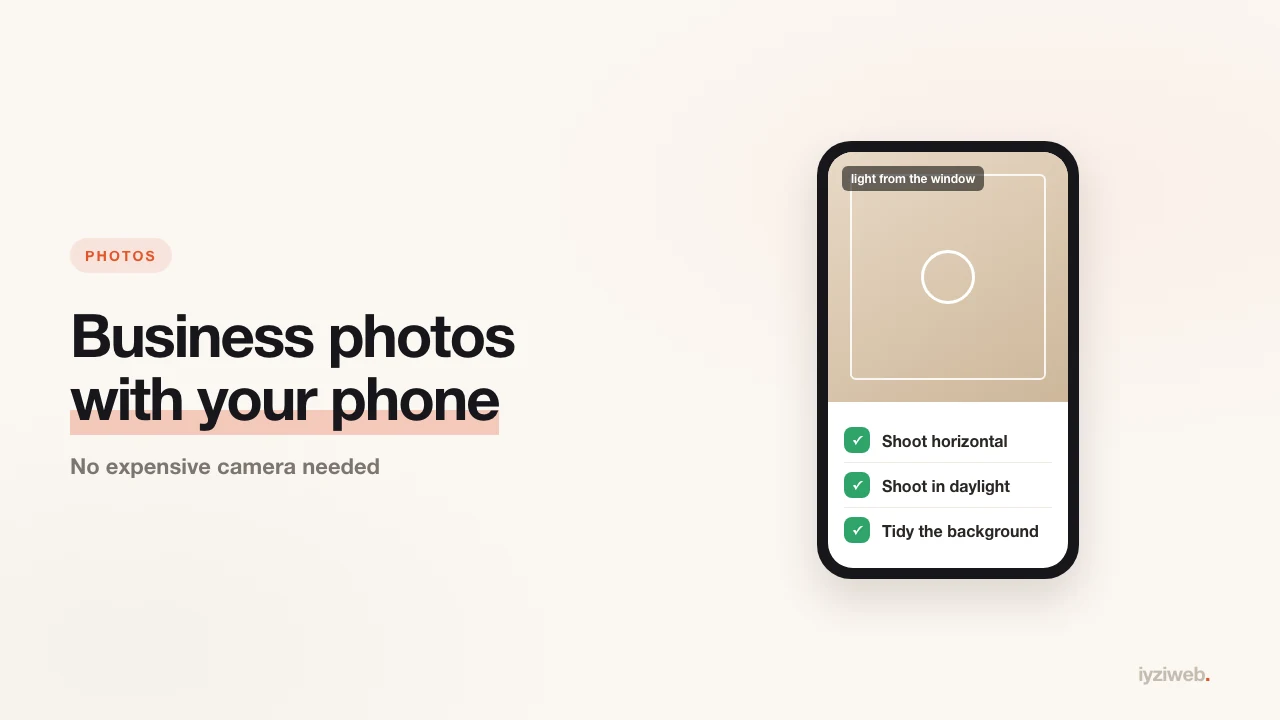
Midday sun is the worst light: hard shadows on faces, glare on windows. The best hours are roughly 9-11am and 4-6pm. Indoors, shoot in daylight and switch the ceiling lights off — window light always wins.
2. Put the light in front of you, not behind
With a window behind you, the phone exposes for the window and everything in front comes out dark. Keep the window in front of or beside your subject.
3. Tidying beats technique
A cable, a cardboard box, a bin, an upturned chair, last year's calendar on the wall — one stray object in frame ruins an otherwise good shot. Spend two minutes clearing up before you start. This is the step that makes the biggest difference.
4. Hold the phone horizontally, at eye level
Websites and Google profiles display horizontal images better. Vertical photos end up cropped or padded with empty space.
Eye level is the right height too: shot from below, a room looks squat; from above, it looks small.
5. Do not zoom, walk closer
Pinch-zooming crops the image and drops the sharpness. Take a step forward. Use the main camera — on most phones the extra lenses are weaker.
6. Get these 6 shots, whatever your trade
The set that works hardest on a site and a Google profile:
- Exterior and sign — so people recognise you from the street
- The first view from the door — it gives a sense of the place
- Work in progress — scissors in hand, at the bench, mid-repair
- The product or result — the plate, the haircut, the fixed unit, the bouquet
- You and the team — seeing a face raises trust more than anything else
- A detail — material, tool, texture; it gives the page room to breathe
7. Take 3-4 frames from the same spot
The first frame is rarely the best. Take several from the same angle and choose calmly afterwards. Phone storage is free; recreating the moment is not.
8. Skip filters, fix sharpness and light
Heavy filters date within a couple of years and look artificial. Three adjustments in your phone's own editor are enough:
- Exposure — lift it slightly; dark photos look cheap
- Contrast — a small increase
- Straighten — make horizontal lines (tables, counters, horizon) level
9. Shrink them before they go on the site
A photo straight off a phone can be 4-8 MB. At that size images weigh the site down, and on a mobile connection the visitor leaves before the page appears.
Target for web: 1600 pixels on the long edge, under 300 KB. The WebP format gives the same picture in a noticeably smaller file. Why that matters is spelled out with numbers in why website speed matters.
Three common mistakes
| Mistake | What it causes | What to do |
|---|---|---|
| Using stock photos | Visitors do not recognise the place, trust drops | Your own photo beats a polished fake |
| Shooting at night with flash | Hard shadows, yellow-blue colour shift | Reshoot in daylight |
| Using a screenshot | Blurry and low resolution | Use the original file |
Upload the same photos to your Google profile
Having photos on your Maps listing directly affects click-through. Upload the same frames you used on the site to your Google Business Profile and add a new one every month — active profiles look alive.
If you have not opened the profile yet, adding your business to Google Maps walks through it step by step.
For the words sitting next to those photos, see how to write website copy; together they finish the page.
In short
Good business photography needs daylight, a tidied space, an eye-level horizontal frame and six core shots. If you can afford a photographer, great — but an empty site waiting for a photographer costs you far more customers than honest phone shots ever will.